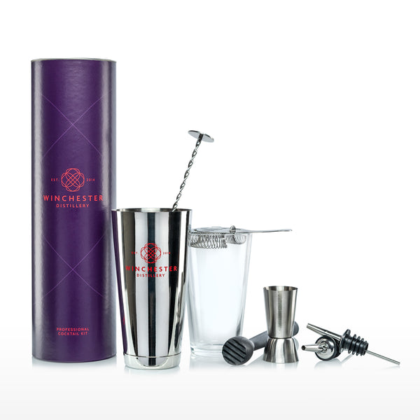
Our New Branding
Following our fifth anniversary and successful crowdfunding campaign last year, we are excited to share with you the next step in evolving the business - our new branding.
Working with Valiant, the agency that designed the stunning new bottle for Twisted Nose Gin, the last few months have been spent creating a new identity for us, ensuring that references to Winchester’s rich heritage are retained, which were previously captured with our Alfred the Great logo.
The new rose symbol logo, acts as a stamp of quality and draws inspiration from the Hampshire Rose. The concept began life as a simplified outline of a window at Winchester Cathedral. It was then multiplied geometrically to form the final design. Many shapes can be traced within its form – a rose, leaves and petals, ripples expanding across the surface of a stream and a droplet of water ready to fall. It is precise and modern while referencing the repeating patterns of heritage architecture.
When it came to selecting our new colour palette, we went back to our early days, when we were based in the heart of the city. The bountiful past of Winchester, woven with stories of royalty, influenced the decision of purple and red. Long considered colours of royalty due to the rarity of the blue and red dyes originally used to produce them, Valiant proposed a rich purple combined with a contemporary shade of red to provide a fresh approach without losing the emphasis on the historical references.
As you will see, our website has already been updated with our new look and you will see our new branding rolled out throughout the business over the coming weeks on everything from our gazebos to what the team are wearing. We look forward to seeing lots of you throughout Spring and Summer so that we can share more of our plans with you in person!


